Heart
Disease Prediction End to End
Machine Learning Project
(Model Creation)
In this part we are going to write a code to create a machine-learning model which will help us to predict is that person is suffering from heart disease or not.
Data Set For Heart Disease Prediction Project: DATASET
Requirements: Python >= 3.6
Jupyter Notebook
It's a clean, easy to understand set of data. However, the meaning of some of the column headers is not obvious. Here's what they mean,
1.age: The person's age in years
2.sex: The person's sex (1 = male, 0 = female)
3.cp: The chest pain experienced (Value 1: typical angina, Value 2: atypical angina, Value 3: non-anginal pain, Value 4: asymptomatic)
4.trestbps: The person's resting blood pressure (mm Hg on admission to the hospital)
5.chol: The person's cholesterol measurement in mg/dl
6.fbs: The person's fasting blood sugar (> 120 mg/dl, 1 = true; 0 = false)
7.restecg: Resting electrocardiographic measurement (0 = normal, 1 = having ST-T wave abnormality, 2 = showing probable or definite left ventricular hypertrophy by Estes' criteria)
8.thalach: The person's maximum heart rate achieved
9.exang: Exercise-induced angina (1 = yes; 0 = no)
10.oldpeak: ST depression induced by exercise relative to rest ('ST' relates to positions on the ECG plot. See more here)
11.slope: the slope of the peak exercise ST segment (Value 1: upsloping, Value 2: flat, Value 3: downsloping)
12.ca: The number of major vessels (0-3)
13.thal: A blood disorder called thalassemia (3 = normal; 6 = fixed defect; 7 = reversable defect)
14.target: Heart disease (0 = no, 1 = yes)
Code:
# Importing Essential Libraries
import numpy as np
import matplotlib.pyplot as plt
import seaborn as sns
%matplotlib inline
# calling our CSV file (Your Dataset should be of CSV format)
# To create your CSV file go to Excel file and save as CSV : Ctrl + S } Format==>CSV
data.head()

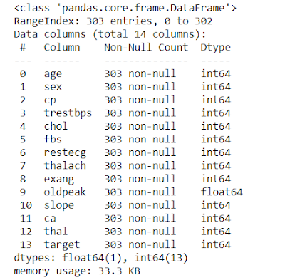
# Gives Complete information of the data values such as Number of Data present, Null or Not-Null, Data type
# Counting the target values
1 165
0 138
Name: target, dtype: int64
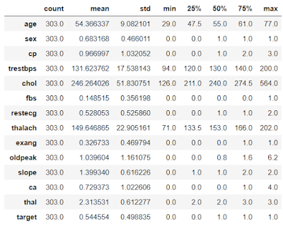
# Give a complete statistical description of the Data
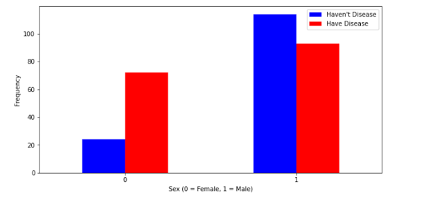
# This will show us people who suffer from heart disease with respect to the sex i.e Male and Female
plt.xlabel('Sex (0 = Female, 1 = Male)') # X-Label
plt.xticks(rotation=0) # Get or set the current tick locations and labels of the x-axis.
plt.legend(["Haven't Disease", "Have Disease"]) # legend = Index
plt.ylabel('Frequency') # X-Label
plt.show() # Help to show our diagram
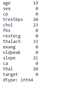
# Finding the numbers of outliers which are present in each feature
Q3 = data.quantile(0.75)
IQR = Q3 - Q1
((data < (Q1 - 1.5 * IQR)) | (data < (Q3 - 1.5 * IQR))).sum()
# Let's Find out the Distribution of Continuous values
dataset = data.copy()
dataset[feature].hist(bins=25)
plt.xlabel(feature)
plt.ylabel("Count")
plt.title(feature)
plt.show()

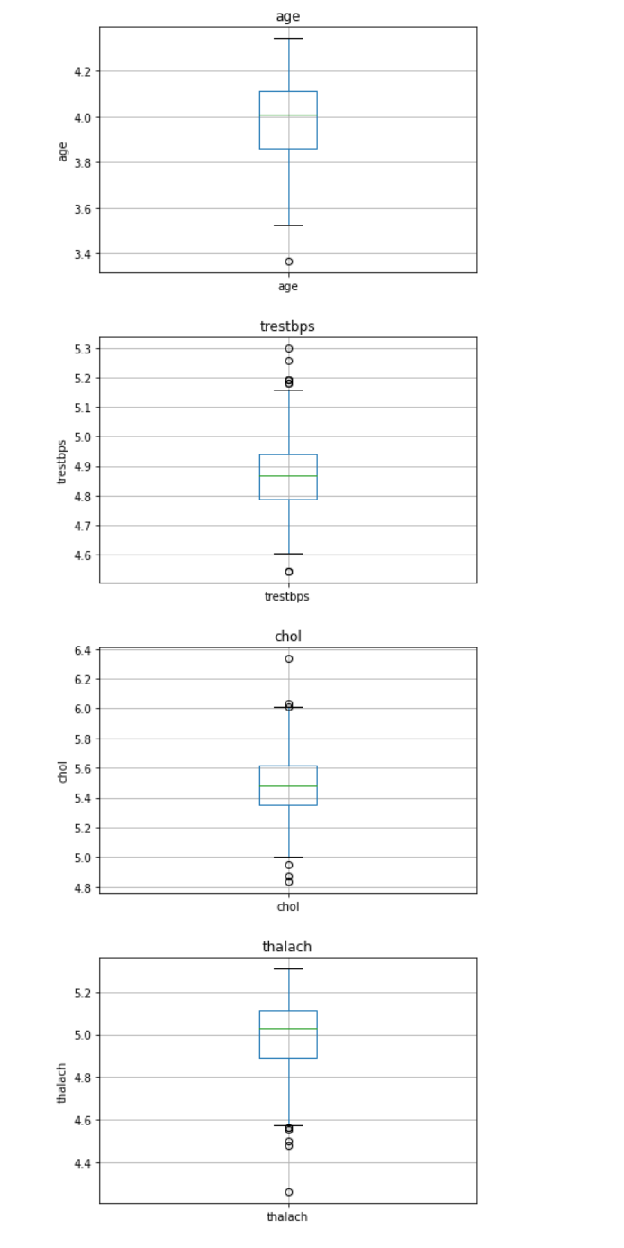
# Analyzing and treating outliers with a box plot
dataset = data.copy()
if 0 in dataset[feature].unique():
pass
else:
dataset[feature] = np.log(dataset[feature])
dataset.boxplot(column=feature)
plt.ylabel(feature)
plt.title(feature)
plt.show()
# Detecting outliers using z_score
def detect_outliers(values):
Threshold = 3
mean_val = np.mean(values)
std_val = np.std(values)
for i in values:
z_score = (i-mean_val)/std_val
if np.abs(z_score) > Threshold:
outliers.append(i)
return outliers
out = detect_outliers(data['age'])
out
[]
def detect_outliers(values):
Threshold = 3
mean_val = np.mean(values)
std_val = np.std(values)
for i in values:
z_score = (i-mean_val)/std_val
if np.abs(z_score) > Threshold:
outliers.append(i)
return outliers
out = detect_outliers(data['trestbps'])
out
[200,192]
def detect_outliers(values):
Threshold = 3
mean_val = np.mean(values)
std_val = np.std(values)
for i in values:
z_score = (i-mean_val)/std_val
if np.abs(z_score) > Threshold:
outliers.append(i)
return outliers
out = detect_outliers(data['chol'])
out
[417, 564, 407, 409]
def detect_outliers(values):
Threshold = 3
mean_val = np.mean(values)
std_val = np.std(values)
for i in values:
z_score = (i-mean_val)/std_val
if np.abs(z_score) > Threshold:
outliers.append(i)
return outliers
out = detect_outliers(data['thalach'])
out
[71]
# From the above analysis we can say that we lack the domain knowledge, so it would be best if we just keep all the dataset as it is.
# Finding the correlation between variables
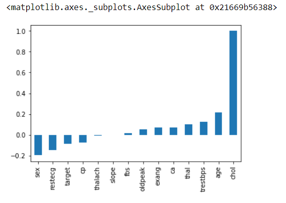
# This will give the correlation between that features
# Example: age in Y-axis and age in X-axis will have the maximum correlation that's why it's dark in color
# annot: Help to see the value inbox
# cmap: The mapping from data values to color space.
# fmt: String formatting code to use when adding annotations.
sns.heatmap(data.corr(),annot=True,cmap='hsv',fmt='.3f',linewidths=2)
plt.ylim(15,0) # show us the exact number of values we want
plt.show()
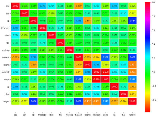
# This will show us Heart Disease Frequency for Ages
# Target: YES/NO
# color: Green / Yellow
plt.title('Heart Disease Frequency for Ages')
plt.xlabel('Age')
plt.ylabel('Frequency')
plt.show()
# The train_test_split function is for splitting a single dataset for two different purposes: training and testing. The testing subset is for building your model. The testing subset is for using the model on unknown data to evaluate the performance of the model.
# train_test_split is a function in Sklearn model selection for splitting data arrays into two subsets: for training data and for testing data. With this function, you don't need to divide the dataset manually. By default, Sklearn train_test_split will make random partitions for the two subsets. However, you can also specify a random state for the operation.
# .values: This returns back the numpy array
# X, y: The first parameter is the dataset you're selecting to use.
# train_size: This parameter sets the size of the training dataset. There are three options: None, which is the default, Int, which requires the exact number of samples, and float, which ranges from 0.1 to 1.0.
# test_size: This parameter specifies the size of the testing dataset. The default state suits the training size. It will be set to 0.25 if the training size is set to default.
# random_state: The default mode performs a random split using np.random. Alternatively, you can add an integer using an exact number.
X = data.drop('target', axis=1).values
y = data['target'].values
X_train, X_test, y_train, y_test = train_test_split(X, y, test_size=0.2, random_state=2)
# Database normalization is the process of structuring a relational database in accordance with a series of so-called normal forms in order to reduce data redundancy and improve data integrity.
# Transform features by scaling each feature to a given range.
# MinMaxScaler: This estimator scales and translates each feature individually such that it is in the given range on the training set, e.g. between zero and one.
# By fit the imputer calculates the means of columns from some data, and by transforming it applies those means to some data (which is just replacing missing values with the means). If both these data are the same (i.e. the data for calculating the means and the data that means are applied to) you can use fit_transform which is basically a fit followed by a transform.
scaler = MinMaxScaler()
X_train = scaler.fit_transform(X_train)
X_test = scaler.transform(X_test)
Creating Machine Learning Model.
1)Logistic Regression:
If you want to know more about Logistic Regression, you can definitely check out these blogs which are written in very simple language.Logistic Regression Blogs:
7 most frequently asked Logistic Regression Questions Answered in 1 blog.
How To Find Optimal Threshold Value And Change Threshold Value In Logistic Regression?
lr_model = LogisticRegression()
lr_model.fit(X_train,y_train)
lr_pred = lr_model.predict(X_test)
from sklearn.metrics import classification_report, confusion_matrix
print(classification_report(y_test,lr_pred))

[[25 7]
[ 1 28]]
2)Support Vector Machine:
If you want to know more about Support Vector Machine, you can definitely check out our blog which is written in very simple language.Support Vector Machine Blog:
Support Vector Machine in Machine Learning
clf_model = svm.SVC(kernel='rbf')
clf_model.fit(X_train,y_train)
clf_pred = clf_model.predict(X_test)
from sklearn.metrics import classification_report, confusion_matrix
print(classification_report(y_test,clf_pred))

[[26 6]
[ 1 28]]
3)Random Forest:
If you want to know more about Random Forest, you can definitely check out our blog which is written in very simple language.Random Forest Blog:
Top 10 Strategies Which Will Make You King Of RANDOM FOREST [2020]
rf_model = RandomForestClassifier(n_estimators=200)
rf_model.fit(X_train,y_train)
rf_pred = rf_model.predict(X_test)
from sklearn.metrics import classification_report, confusion_matrix
print(classification_report(y_test,rf_pred))
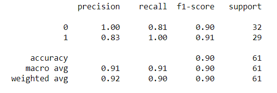
[[26 6]
[ 0 29]]
import joblib
joblib.dump(rf_model,"Heart_Disease_Prediction.pkl")
['Heart_Disease_Prediction.pkl']
m = joblib.load('Heart_Disease_Prediction.pkl')
m.predict([[55,1,3,145,233,0,0,150,0,2.2,0,0,1]])
array([1], dtype=int64)
So From these, we can conclude that our model is performing great and we are ready to deploy it with the help of flask, which we will see at our next blog.
Click this link for part 2:
Follow us at :
Instagram :
Facebook :
https://www.facebook.com/InfinitycodeX/
Twitter :
https://twitter.com/InfinityCodeX1


No comments:
No Spamming and No Offensive Language